Author: Zenel Batagelj
One thing will remain – customer is the king, especially during and after the coronavirus outbreak. The magic formula of getting out of crisis as a winner hides a great understanding of the consumer in these difficult moments. It is important for businesses to understand how consumer operates and what his or her intentions are, where are we in comparison to pre-corona conditions thus how far from the (new) normal condition.
Therefore, we are in need to be consciously aware of the virus presence in the consumer’s environment, its reality, its sense of security and level of concern. As the virus spreads exponentially, changes are rapid, thus daily monitoring is strongly recommended and required.
At VALICON, we have the largest community of randomly selected individuals on our online panels who occasionally respond to our survey research. We have repeatedly demonstrated that with advanced smart sampling, the results of these survey estimates work better than traditional survey data collection methods.
At this point we thank all of our jaZnam panelists (.si, .hr, .ba, .rs) who participated in the research.
Our goal is to have a better understanding of how the business environment will change as a result of the virus. The longer the emergency will last, the more the consumer will change, and thus the business environment.
Valicon presents its crisis understanding model on the diagram below. Most indicators will be presented comparatively across the four major countries of the region, emphasizing how the indicators will change with extension of the virus outbreak. The longer the period, the less likely we are to return to old normality after crisis ends.
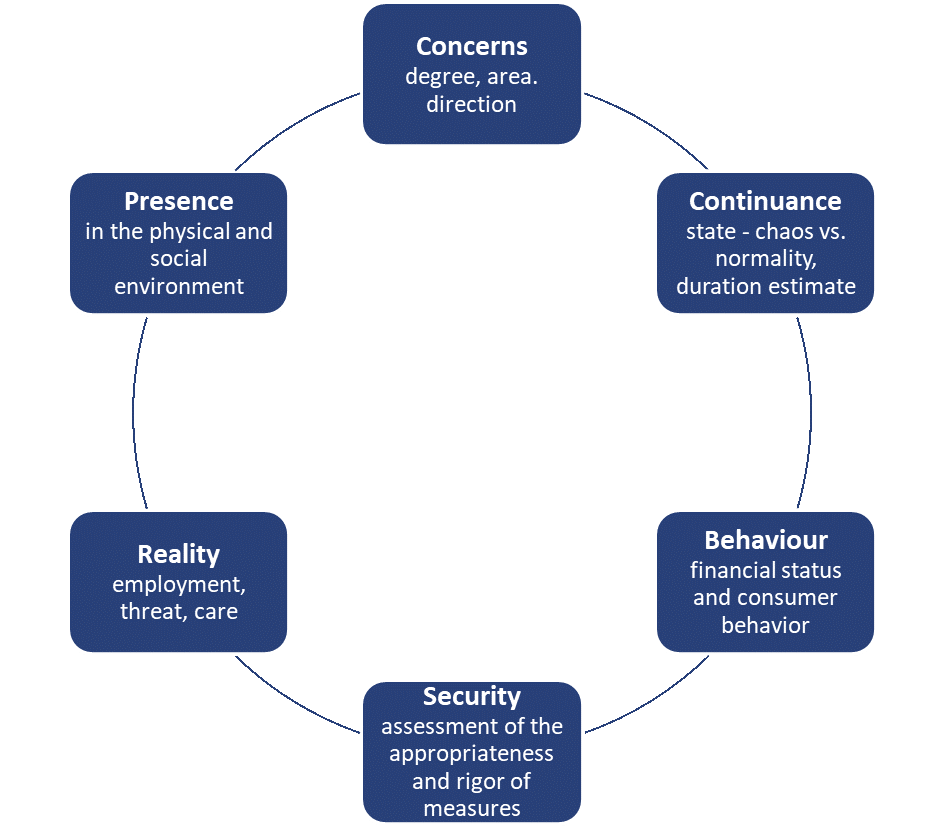
Picture 1: Valicon COVID-19 indicators
Reality
Close to one-third of respondents said they were more likely to be at risk of being infected by coronavirus. This indicator shows us that people have taken the virus for real and that they are being vigilant even more than they actually should be, which is great, given the many unknowns related to virus. Although belonging to a risk group is a fairly objective fact (age, chronic disease…), various information is emerging that affects our subjective perception of the extent to which person is at risk. The indicator is far from stable. With higher mortality, more information about the dead and its implications will be available to analyse. The more of those under the age of 65, the greater the proportion of those who will self-diagnose being at risk. This group of indicators also includes level of concerns and changes in their employment status, which will not be shown this time due to space constraints.
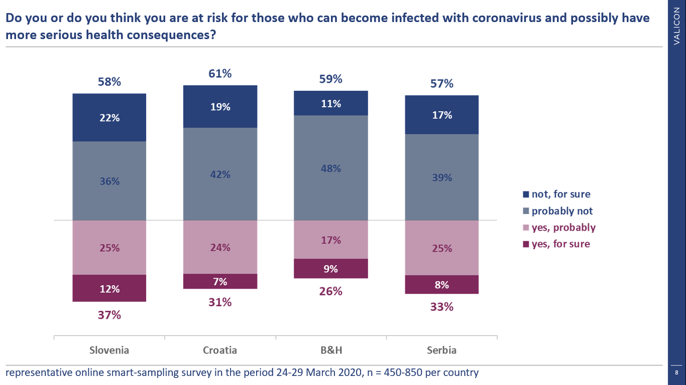
Graph 1.: Risk of infection
Presence
Official statistics measure the (confirmed) prevalence of the virus. What we measure in the survey is prevalence in terms of physical presence – in the environment of the individual, and social prevalence – presence in the family circle, the circle of colleagues and friends.
Knowing the fact that when a phenomenon actually happens in the narrowest circles of an individual, the phenomenon becomes the actual reality of such. Given that the prevalence across four countries is fairly similar, we expected similar results across countries – on average, the virus is a reality for about 7% of respondents.
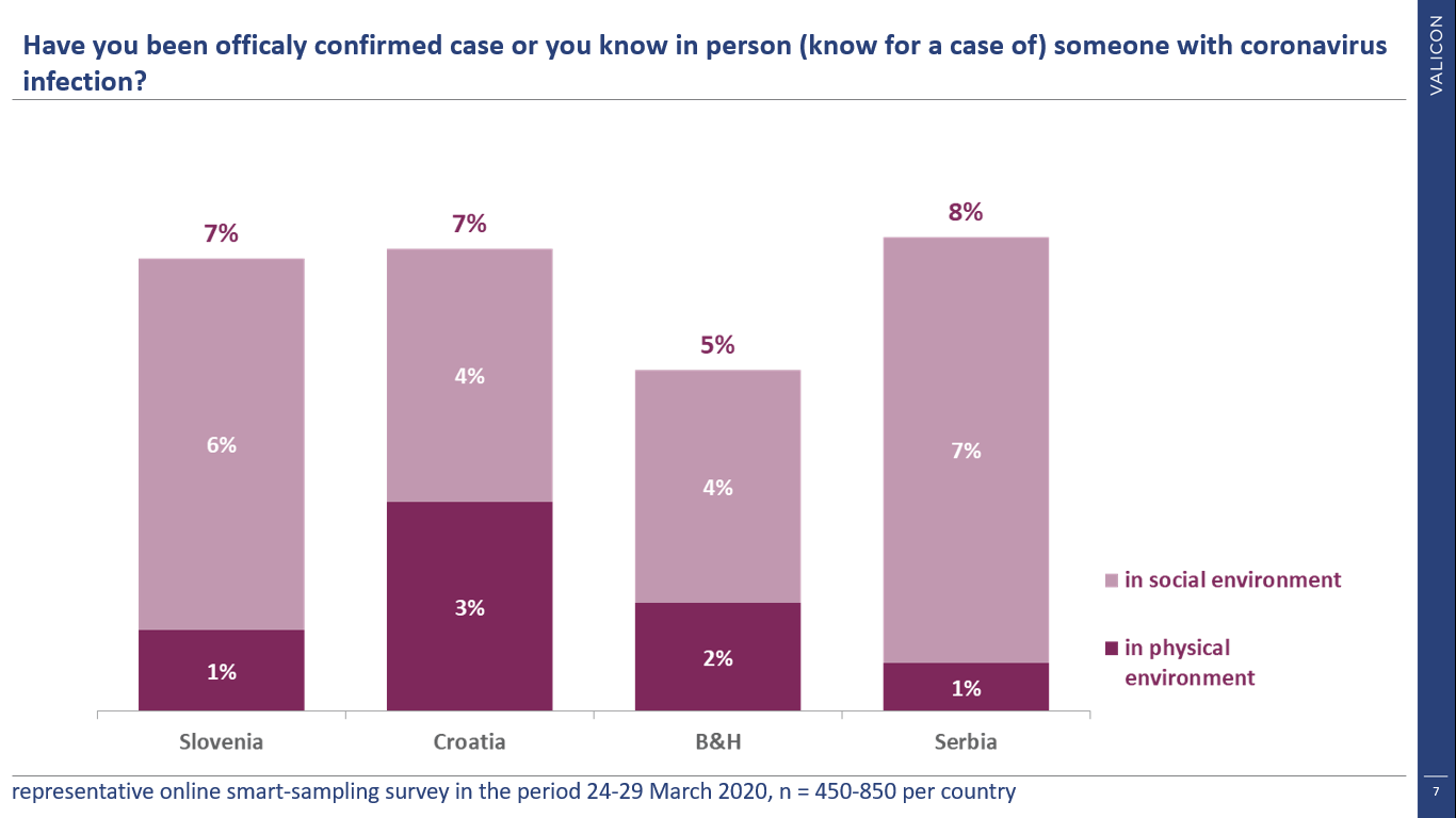
Graph 2.: Presence of COVID-19 in social and physical environment
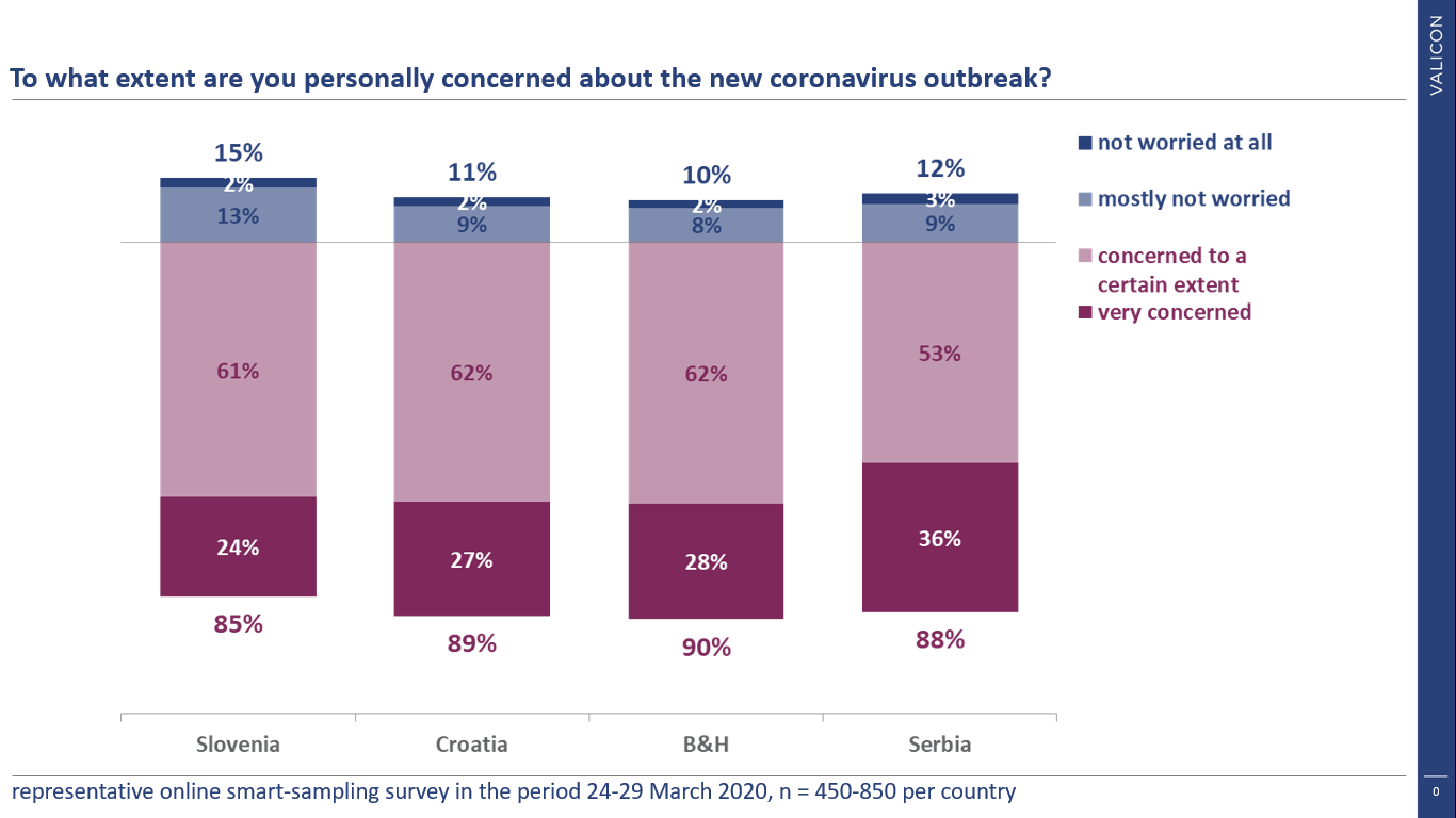
Concerns
Two weeks ago, which is a big thing in the survey business and public opinion during fast pace of epidemic, we measured the awareness of the virus. Familiarity is virtually ubiquitous, so as anxiety. Almost 90% of respondents are concerned, slightly over a quarter are very concerned. The proportion of those very concerned is likely to increase over the course of epidemic.
Graph 3.: Degree of concern
Answer to why respondents are concerned is probably the most indicative question related to virus outbreak as social phenomena. For once, the family is consistently in first place with a score between 75% and 85%, and the workplace (for once) is at the bottom with about 10%. Over time, the percentage of job-related concerns would presumably increase.
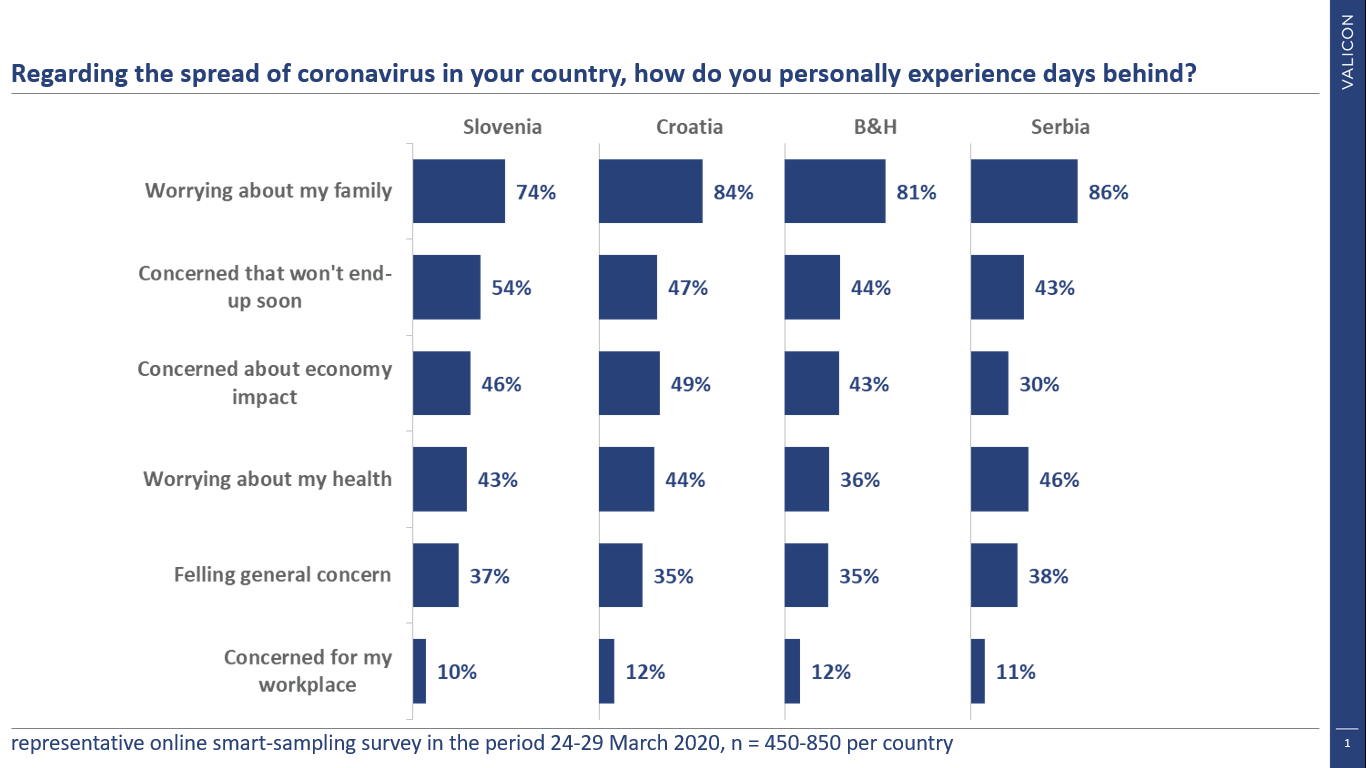
Graph 4.: Personal experience of COVID-19 outbreak
According to the results of the perception of the dynamics, we could say that the first wave of “panic” is behind us – more than half of them think that things are going towards better. We can observe BiH as an exception, which slightly lags behind the other three countries. The government measures are clearly “working”. Half of respondents slowly adapted to the new reality, based on first package of countries’ measures in this domain.
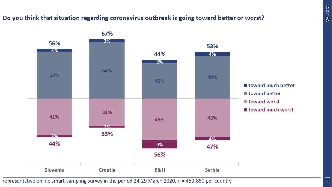
Graph 5.: Degree of optimism/pessimism
Security
Security is exceptionally related to the perception of governments measures and decisions. We measure both aspects: short-term measures related to restraint, social distance and the perception of longer-term measures, which are primarily aimed at curbing economic negative consequences. Up to 14% of respondents in Serbia anticipate short-term measures as unacceptable, where taken measures were extremely fast and very restrictive from the outset, while Slovenia aspired toward stringent measures which were fetched on 29th of March.
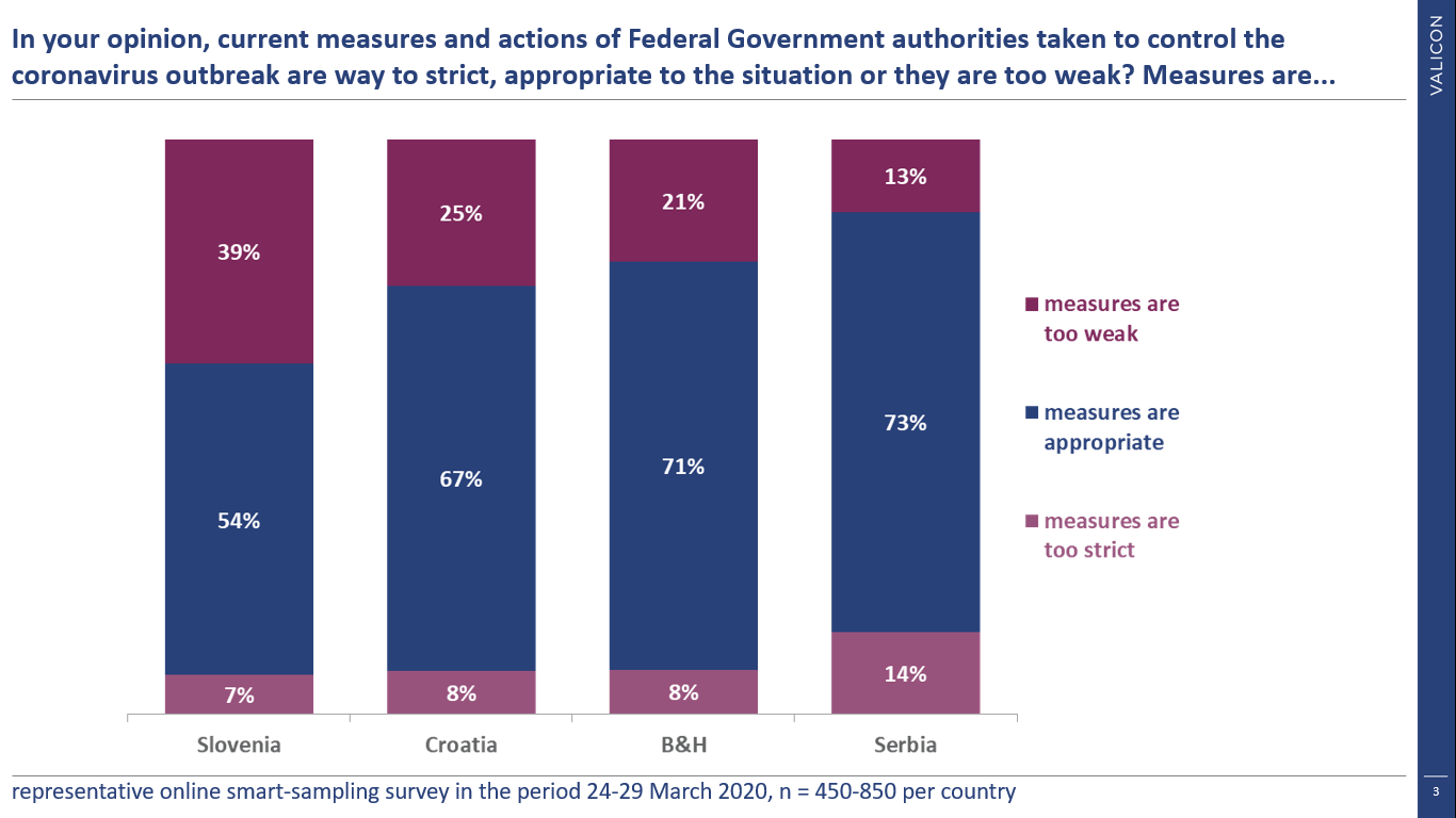
Graph 6.: Attitudes towards actions and measures of Federal Government authorities regarding COVID-19
The public is satisfied with the long-term measures, the least satisfied in B&H, where the measures are lagging behind the other three countries. An important note is that the concrete proposal of measures was presented in Slovenia on 29th of March, the results of which are not yet covered. Thus, we can conclude that the general public is fairly pleased with the measures of the governments, while at least in Slovenia and Croatia there is still some space for introducing more stringent measures.
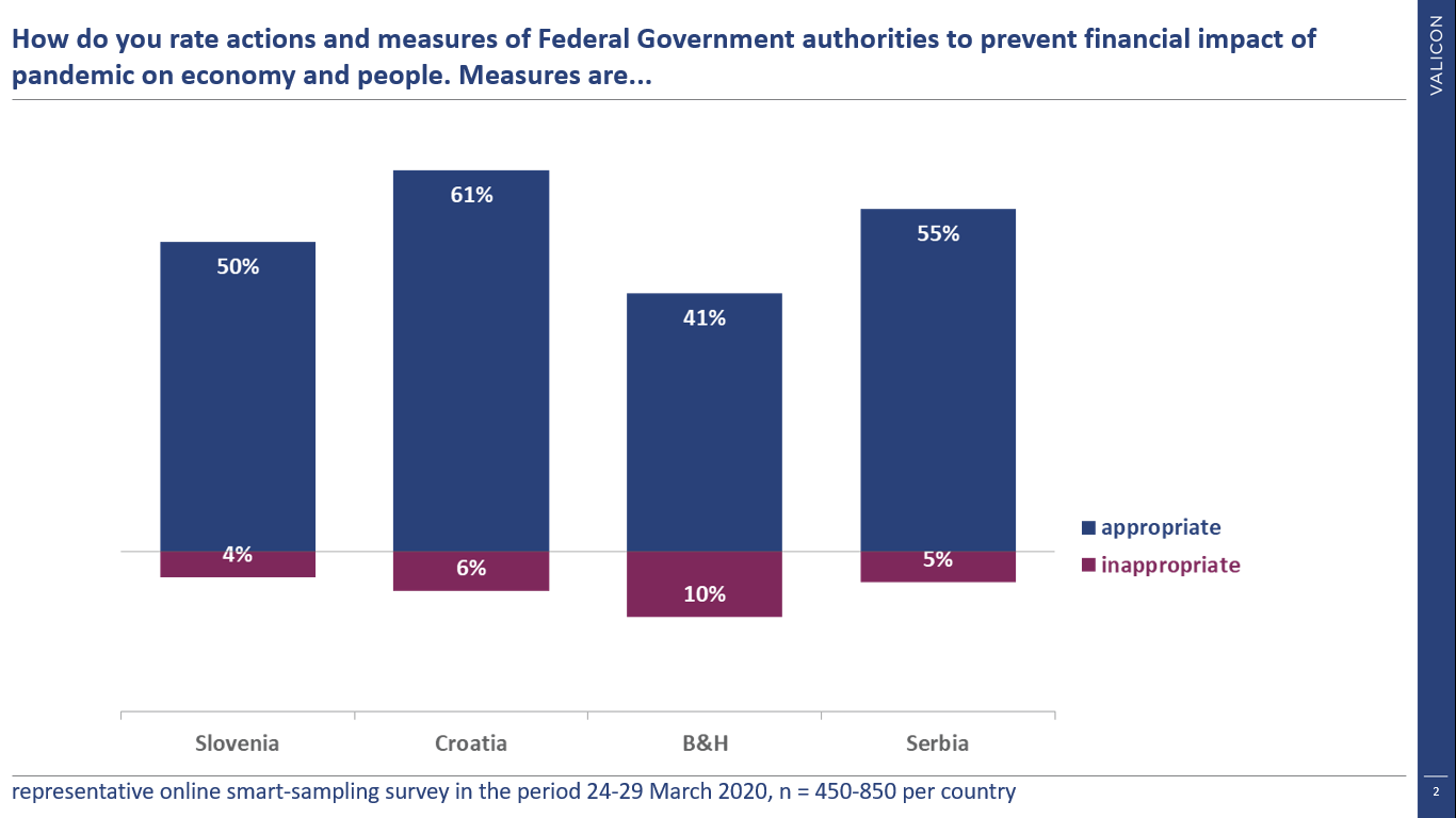
Graph 7.: Attitudes towards economic actions and measures of Federal Government authorities regarding COVID-19
Continuance
So far, all indicators have been of a more explanatory nature, hiding in themselves the elements of the KPI’s of new “normality”, which is our primary goal. However, continuance performance indicators are key to understanding actual changes in consumer behavior. The perception of the crisis duration is important because consumers make the most of their purchasing decisions relying on it. The longer this condition takes, the more time consumers will have for behavioral patterns to “anchor” in a period of new “normality”. We can see that the most optimistic are Slovenians, estimating that outbreak will last 2 months. However, it is true that the first measures were first introduced in Slovenia and we have some “stocks” in Slovenia. Other countries in the region estimate that the situation will last slightly less than three months. While watching this indicator closely we put our hopes in further decreasement of it.
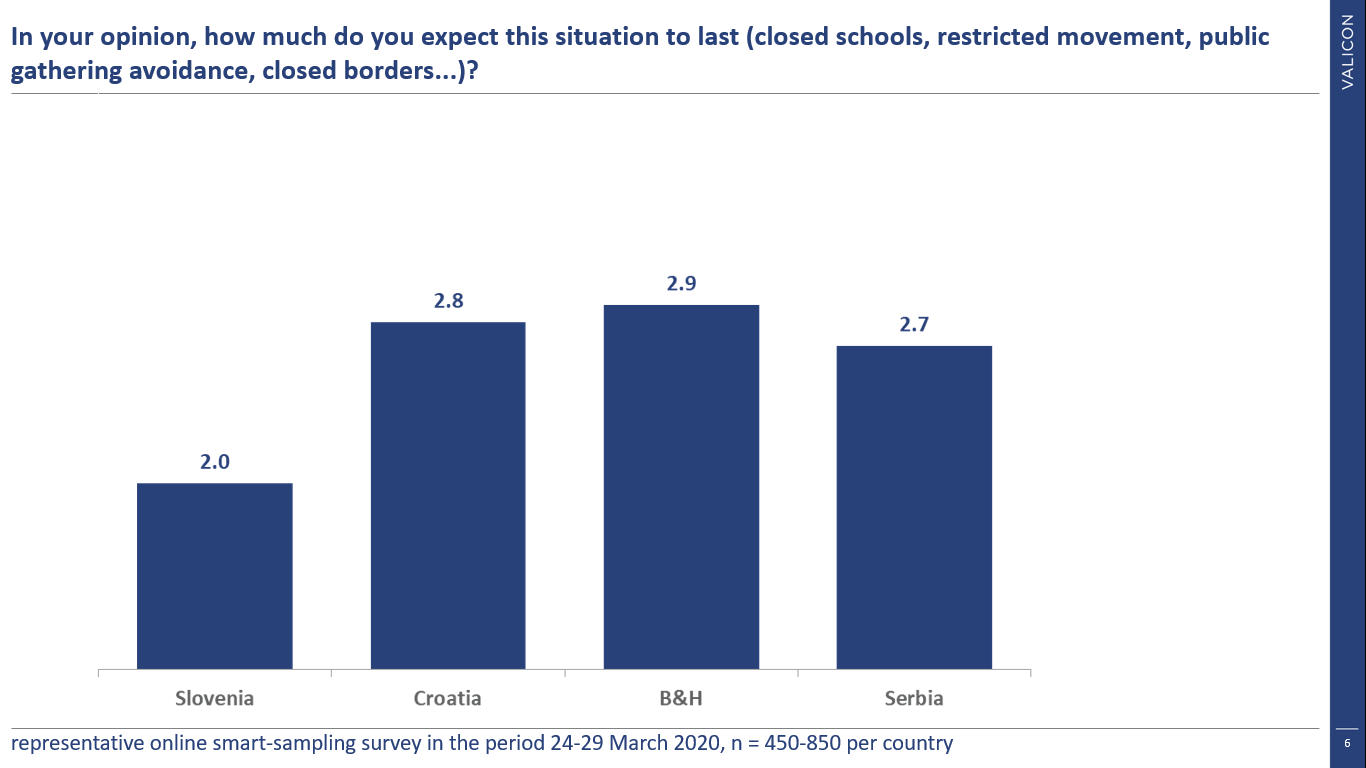
Graph 8.: Expected duration of COVID-19 outbreak
We are especially proud on this indicator. A colleague Esma from Sarajevo is still reliving the war period and thinks that sooner or later we will move to a “new reality”, coherent to “normal, in the new situation” response. We are far away from normal, with an average of about 15% saying that the situation is normal. Observing this as a good, perceived situation is not hopeless nor critical, but across polled countries the most common answer is “unpleasant and exhausting”. The road to (new) normality is still a long drive, but to begin change, the engine of respondents will have to turn on and move to an “acceptable” part of graph.
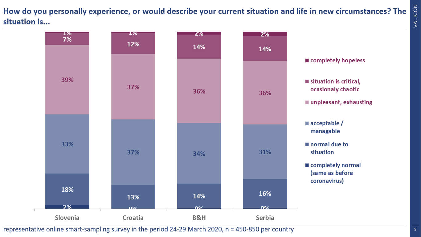
Graph 9.: Experiencing current situation
Behaviour
Analyzes made so far have shown absence of greater “panic”. The government is acting accordingly, circumstances are directed better, of course we are concerned about being away from normal, but we think the matter will last no longer than 2 months.
The indicators below are “battle-tested” and have been used and measured on a regular basis since 2008 – the famous Marketing Monitor, which is implemented in conjunction with DMS. Consistently across each country, there is an expectation of deterioration.
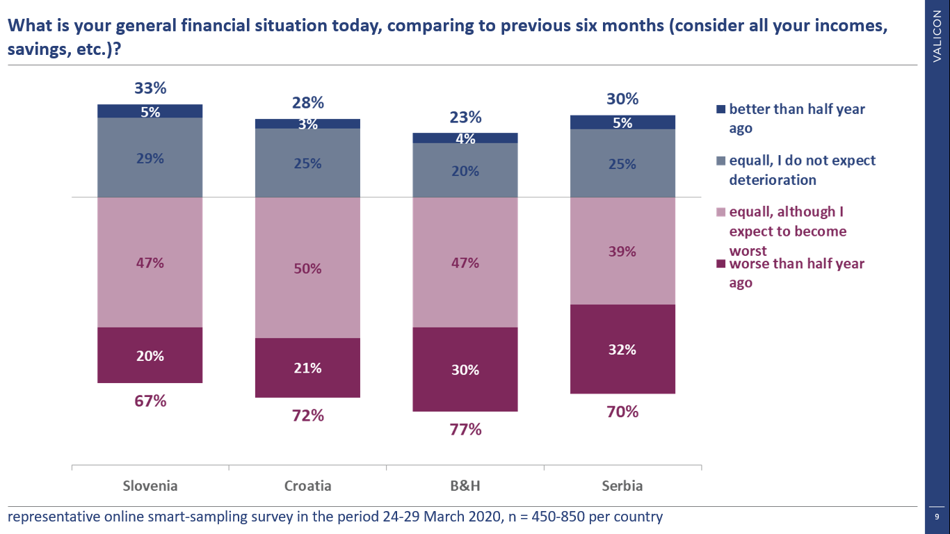
Graph 10.: Financial situation during COVID-19 outbreak
Which logically affects the expected consumption (purple part of graph below) has not yet been fully realized, but it can be.
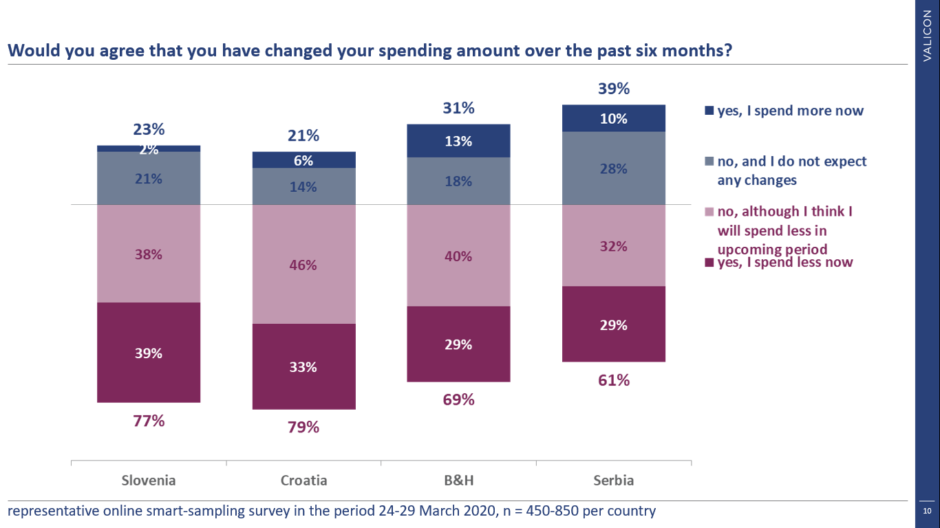
Graph 11.: Change in consumption habits
Based on these two questions, we’ve been creating a specific segmentation with a time series since 2008, which will be presented in time to come. Certainly the influence of the corona outbreak is already present and may be felt even more in the future.
No need to panic, Valicon is with you!
Keeping track of indicators (by the way, there are quite a few more) at least on a weekly basis and observe how events affect their movement. In addition, we have measured the same indicators at some of the relevant global focal points, so we have benchmarks for what lies ahead.
Based on this, we are working on Corona Index development, to predict break points. Of course, indicators are not only observed on the whole population, but also on key marketing segments, because the entire methodology is based on Valicon’s online panels and the indicators themselves are compared with the situation before the crisis. Also, the possibility to monitor selected indicators in real-time on our website would be available shortly.